Skills Audit (9/9/24)
.png)

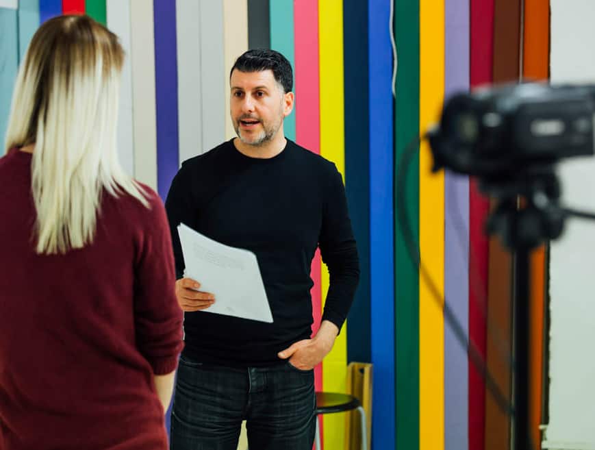
Mind Map - Work Experience Ideas

Jobs In Media
Film Or TV Assistant Director

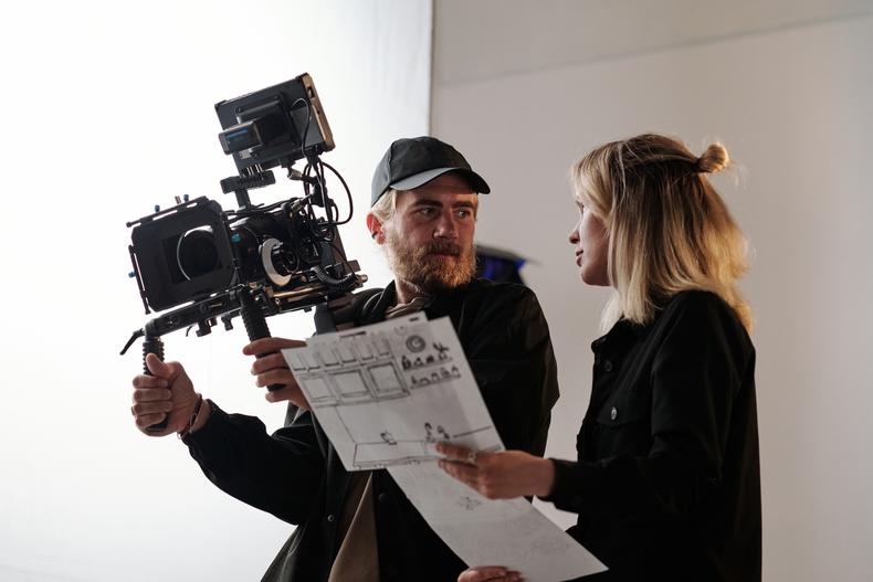
Actor

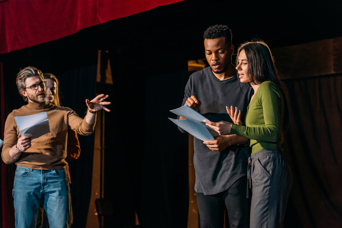
TV Presenter

What I'm Making For Audience's Needs (26/9/24)
For this I will work with the rebranding for Stanmore College. As part of this I want to have a proper rebranding of the college and encourage young people to join next year. Throughout this process, I would like to gain new skills on the standard of working for a client and their needs for what they expect from this. This is through the new building works that are currently taking place and is a way to completely rebrand the college. I hope when doing this I can also develop new skills with software use as it's primarily what's expected from doing this for the college. I don't know yet who specifically my client is yet and what's expected for me to make, but will do my best to make it good. As a prediction, I think they would ask to make a new logo and promotional posters about the college. I am open to new ideas and improvement from the client on what they want from this. It will also get me to learn something similar on the media work space. I hope when working for a client that it will be an enjoyable experience for me to do.
New Logo Design For Stanmore College (10/10/24)
As part of the rebranding of the college, they wanted a new logo. Through this I conducted research on various logos, with and without text to give me ideas on what I should design to make a better logo than what's currently there. I made some practice designs on Adobe Illustrator and being honest they weren't the best. But for the next few designs I will sketch it on a piece of paper of my ideas as it would help me a lot better with creating better designs for next time as I never thought about doing that at the time.
Client Introduction - Stanmore College (7/11/24)
Stanmore College is a post 16 education where people can study a specific course that they believe they're good in or they enjoy the subject. They also offer courses for adults to complete as well and apprenticeships as well. They opened in 1987 forming from a sixth form college and changed their name in 1994 to Stanmore College. Right now they're doing building works and creating new and better facilities for students and adults to use and enjoy their time there. They're also going through a rebranding phase alongside building works to make the college have a more modern feeling to it. When we get to know what our client needs from us, I think that having name ideas for new buildings when complete (if they haven't decided on them yet) and have a slogan for the college.
New Logo Practice Designs I Made (10/10/24)
These are some of my practice new logo designs for Stanmore College that I made (not final designs).


Target Audience Research - Stanmore College (21/11/24)
Stanmore College is a post 16 further education in Harrow. Most students who enrol to the college are 16 - 18 year olds, which is primarily the target audience for the new logo design. Most people who do enrol to the college finish school and the logo will push for people outside of college to enrol here. Students here might want to change course or have completed a course and wanted to further their learning on that space.
Interview With Client
In the beginning of October 2024, 2 people who work for the college came to my class to talk about the rebranding of the college. They asked to make new logo ideas (up to 5) and to make it appealing to young people who want to enrol to a college to begin their further education. They never specified a certain colour scheme to use so I'll have to think some of my own. They said this to everyone but they were doing other things as part of their work experience.
Different Logos Research
To get some inspiration of a new logo design, I looked up various logos from all industries and to understand what makes them stand out to the audience. I'm specifically looking for logos that suit young people between 16 - 18 year olds and what they're familiar with. Most business logos I found had a symbol that people recognise. For example Twitter had the blue bird (now changed to X), KFC had Colonel Sanders (founder of KFC) and Nike tick as part of symbols. There are other logos that only have text like Google, Coca - Cola and Kelloggs. Each of them have their very own type font and style to make it stand out to audience attention.
Logos With Text Only

Logos Without Text
Next I looked up logos that are used for schools in the UK. Most symbols that I found have a design in the middle that catches attention of parents and possibly school kids. Some symbols that I found have trees, flowers and shields. For UK colleges I couldn't find on google so I had to search up colleges by name to see what I got. Most of the college logos have mostly text on it with a little symbol different areas around. Being honest I feel that the UK college logos are a bit overwhelming as they seem basic and they lack creativity. This will make me motivated to put effort in to try and make a logo that's better than the rest.
Famous Logo Designers
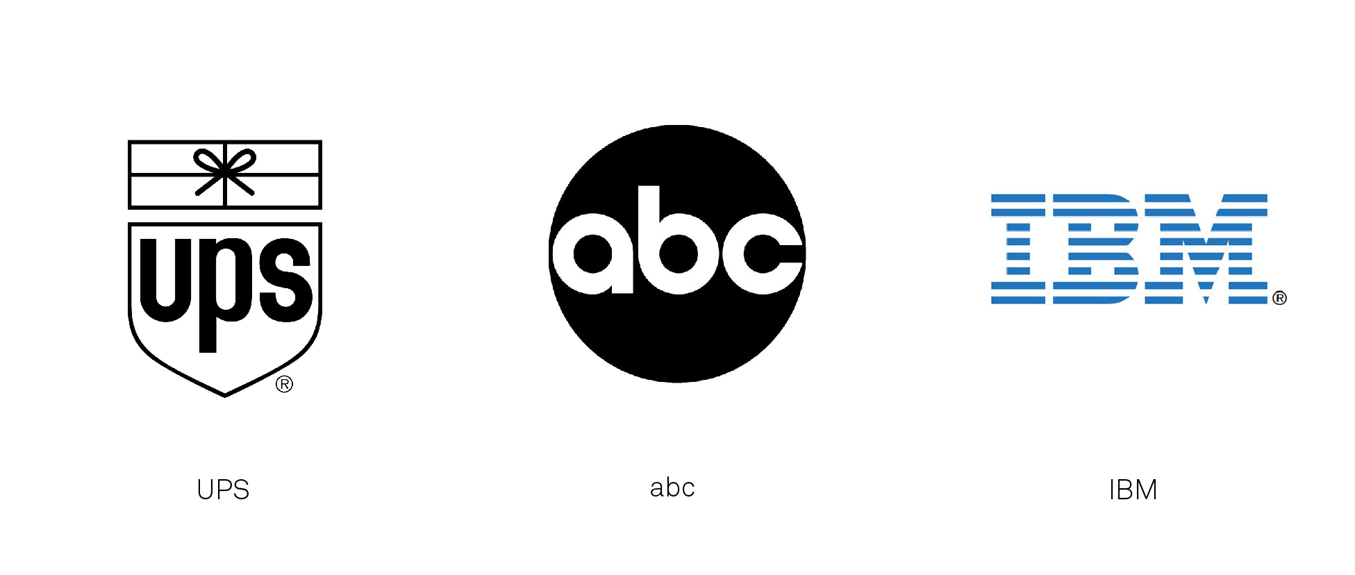
Paul Rand
Paul Rand was an American logo designer and art director. He's best known for making logos for big businesses that are used to this day. A few examples include UPS with a black and gold colour scheme, the American broadcast company ABC and IBM (International Business Machines Corporation). All of the logos are text based with different font designs for each logo. His work is popular to this day because it helped revolutionise commerical art in America during the 1930s.
Saul Bass
Saul Bass was an American graphic designer and an Oscar winning filmmaker, best known for logo designs, title sequences and posters. The logo best known to audience was the old Warner Bros logo in 1972, replacing the traditional shield with a "W" inside a circle. This was the time when they changed to Warner Communications and lasted for 12 years before going back to the traditional shield. Other logos include American Airlines, AT&T and Quaker Oates His logos are filled with graphic designs with little to no text for the logos. He is an influence to people because of making complex visual designs to simple designs.

Logo Design Sketch Planning
Before starting my final design digitally, I want to draw out ideas so that I'm familiar with what I want to create. The earlier designs I made were never planned by sketch, rather than designs that came in my head. I will start sketching my logo ideas for Stanmore College from the week beginning 25/11/24. I won't only draw 1 logo design rather 3 (with colour) and then I'll choose the design I want to proceed as my final logo design for Stanmore College.
Logo Sketches (28/11/24)
Before getting started with creating the new logo for Stanmore College, I did some sketches to get some ideas on what I want to create. One of those ideas that I have was having a book as one of the main objects as part of the logo. This is because it's a sign of education and encourage people to come and learn. On the side of the book I decided to place roses on each side. I did this because I felt like it suited the design and would make it stand out a lot more. At the bottom of the designs I placed Stanmore College. I had a bright and vibrant colour scheme as dark colours would put people off from going to the college. I started dong this design on Adobe Illustrator.
First Official Logo Design
I was able to complete my first logo design mostly on Adobe Illustrator. The text font for the logo I got from Canva because the fonts on Adobe didn't suit the logo environment. I downloaded the font with Stanmore College and placed it below the designs I made. I made the book by using a square and having a line halving it making it seem like a page. Then I added lines so that its like a line of text of the page. On the side I wanted to create a rose, one for each side, to have a positive energy to it. I looked up tutorials on how to create it but added my own spin to it. Below is how I got on with my progress.


Copied the rose from left and pasted it to the right

2nd Logo Design (10/12/24)

This was another logo design that I made for the college. The main part of the logo is a tree with green leaves on branches. I chose to use a tree because it means strength, calmness and growth which is what the college should be aiming for as part of the rebranding. The tools I used to create the tree on Adobe Illustrator was the ellipse tool for the leaves and having the fill green and the branches were made with the paintbrush tool so that I can easily adjust the side. I feel like it's a good design but I wish that I had put a few more branches / leaves on the tree but it's all good. I wanted to make it as a realistic tree so that's why I went for that style.
3rd and Final Logo Design (12/12/24)

For my final design I wanted to be based on an animal that has a symbolic meaning. What I decided was a bird but instead having colourful wings to make it bright and colourful for people to see and having the name Stanmore College at the bottom would need a little more spacing. I also made this on Adobe Illustrator and I'm impressed on how it turned out. Wings can express freedom, power and creative energy which is a good message as a college.
Client Feedback
I sent an email to 2 people as part of the rebranding of Stanmore College. I explained what I was doing and sent off the 3 designs I made for feedback and which ones were their favourite. So far I've gotten 1 response so far which is viewed from the email response below. Then a few days later I got another response from my client from which one out of the 3 was the best one, which she said the colourful one. That was the final design that I made.

Email That I Sent

Before

After
Overall Evaluation on Unit 10
For unit 10, I helped out with the rebranding of the college with making a new logo. I had made 3 designs so that I can experiment and see what my client prefers. Researching in different logos in general, I looked at ones with text only and ones that have a symbol that people can recognise with the company. I also researched college logos around the area to get some inspiration on what to make but they were no good. Because the target audience is mainly 16 - 18 year olds I had to make it bright and vibrant to make it more appealing to them.
From doing the Stanmore College redesign, I learnt from what the client specifically wanted from the logo with colours and making it appealing to the target audience. I didn't really know much from the target audience specifically but I did my best to get their attention to the new logo.
I believe that my logo meets the needs of my audience because I was creative with the types of colours to use and specifically what they see in the logo that will catch their attention. Also, I made different logos on purpose to see which one would make sense to have so people can see what the college is about.
I didn't change much from what I originally planned with for my designs as they were what I wanted for them to turn out like that. But for the tree, I did add more branches and leaves to it without trying to make them look messy and catching the audience's attention.
I think the best piece of work that I created was the last one, the colourful wings. I like it because it matches the needs for my client on the colour scheme and instead of having blocks as the old logo I tried to make them in form of wings. This was so that I can be creative in my designing as well. Out of the 3, it was the one that turned out the best from what I thought about before making them. I made all of these digitally on Adobe Illustrator.
From doing this, I learnt a lot from doing this. One of them is working for a client as I not had the experience of doing this in the past and more of the planning process as well on what to create and research conducted as well. I also learnt about understanding what the client wants and feedback to go with it as well. It can be positive but sometimes negative for underwhelming their expectations on what they wanted.
No comments:
Post a Comment